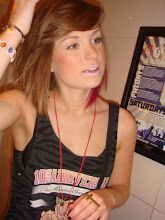
This is a mockup of what we are doing for our poster. To test out the colours, fonts and layout. We think this image is most effective and we will do our own photo inspired by this one. We got the idea for the credits from the new Saw movie poster. We chose to use the same colour and style of writing for our poster that they used because Saw is also a horror film, by Lionsgate like ours. When we do our own photo for the background we will make it darker as in this photo the face is too bright and takes the attention away from the title.
Friday, 13 November 2009
Subscribe to:
Post Comments (Atom)


No comments:
Post a Comment