For our final design we made the image a lot darker than the original to make it look more effective, to give it this mysterious look we can only see a section of the characters face, so it doesn't reveal their identity I think it makes more of an imapact to the viewer.
Looked at titles of 'the strangers', 'the grudge' and 'prom night'. All have institution at begining and title of film at the end with a quick film clip after and then 'coming soon' website and institutions. Then sometimes after that the institution again, actors and directors etc.
We filmed the middle scene of the trailer on Saturday, and the end clips on Monday and todays media lesson! So everything is done hopefully. We have booked out an emergency camera for wednesday just incase we feel some bits need improving or more needs adding in. We also took the photo for our ancilliary task of the poster and edited it in todays media lesson on photoshop... Here is what we did...
^^ Original photo ^^
For this one ^^ we changed it to black and white, flipped it horizontally and changed the contrast and brightness
^^ Original photo ^^
^^Black and white, contrast and brightness changed and coloured the eye in black
This one isn't completely finished but we basically wanted it to be black and white with just the eye still in colour.Sowe had to cut the eye bit out to keep the colour then change the image to black and white and copy the eye back on. We also enhanced the colour of the eye to make it a brighter blue.
These are the photos we took in the style of the stalker. They aren't great but because of how little time we had, it's better to have something rather than nothing. I think most of them look legitimate but they won't be seen for a long period of time so they're just for effect really. We are also going to put them on the films website.
These were some shot idea/tests we did before changing the storyboard.We tried it in two different rooms to compare lighting and space. When we did film these shots, the characters were slightly different and we chose to film in the pink/white room. This test also helped us decide how to place the camera as the quality of these test shots arn't very good, for example the first two.We used the same shots we tested in the blue room when we filmed for real in the other room.
On saturday we completed 1/4 of our filming! We followed our new improved storyboard that will be uploaded onto the blog shortly. We tried to do a variety of shots so we have enough. We did the filming in my garage, the 'kidnapped scene.' This was our main character tied to a chair in distress, frightened and scared this hopefully comes across in our filming with the types of shots we have done. We got our actor looking scared, doing close up shots of the face and eyes to capture the fear. For lighting we used a torch as the room was in darkness. We flashed the torch and experimented with the lighting for dramatic effect.
After realising we would have to scrap all the filming we had already done (although it wasn't that much) I decided I was unsattisfied with the opening scene we have for our trailer. I spoke to a few people, some who also do media, and they said maybe we should start it with scary shots, not the calm atmosphere we had before. I think this is a great idea and will really improve our trailer. I did some more research into trailers to get ideas of how to do this new idea.
Paranormal Activity
This trailer is really effective, it shows the first audience who ever watched the film in the trailer. Seeing their reactions is quite shocking and I think these shots scare you more than the film itself. However in the film a good technique they used was infrared. Most of the film was recorded at night so obviously a night vision camera was used. We originally wanted to use this technique in our film but decided it would be too tricky, but now I think it would be worth giving it a go. Another film we watched at the begining of our research also used infrared, it was called Quarentine.
Skin Walkers
The start of this trailer uses taglines to introduce the story. It also shows quite graphic shots which makes you keep watching. I found this was quite an action film and not exactly horror but they did use intersting techniques to attract the audience and tell the story. Flashing/quick editing of shots is used which creates the action feel and also throughout I noticed a copper theme in most of the shots like a tint, maybe to link in with the characters eyes which were copper coloured.
Thir13en Ghosts
The begining scene of the Thir13en Ghosts trailer has a spooky atmosphere, a blue tint to the shots make this. It also shows that it is dark and looks cold. A white flash is used to skip to a more coloured scene and then as the action comes back into play more white flashes skip between different shots. I think the first flash makes it seem like theres a flashback.
The Strangers
This trailer starts with a calm atmosphere and uses taglines to introduce the story. MUSIC. It also shows the views of the characters having double takes, in the first shot you see a person and in the second you don't. When I watched this it was really creepy and definately worked at scaring the audience. Also the use of masks for the other characters really adds to the atmosphere, not being able to see their face, and you can imagine how scared you would be in that situation.
The Texas Chainsaw Massacre
2-4 second clips are used for the first part of the trailer to set the scene. Then 1 second clips which fade to black are seen, these start to set the pace and atmosphere. I liked the use of freeze frames to show the panic on the characters faces and then faded quickly to white. The last sequence of shots at the end of the trailer are short with quick editing, the clips are also quite dark and the speed of the editing creates an action feel and makes the audience interested.
The Grudge
This trailer really creeped me out. The main element I like about it was how they used a wave of hair to bring the text/titles in and out of the frame.
The Unborn
This trailer also starts off slow and uses white flashes inbetween the scary shots. I really like the titles for this trailer and the background they used. I think the characters really show the genre of this film and just looking at them scares you.
Shaun Of The Dead
I love the trailer for this film, I really like how they've managed to mix together funny and scary and be able to laugh and be scared at the same time.
Looking at all these trailers gave me a great idea for the storyboard. The trailer is going to start with quick editing so you see very short clips, almost flashes, of whats going on like in some of the trailers above. The shots will be of our main character, already been kidnapped, tied to a chair in a room, it will be dark with just a light on her. There will also be shots of the stalker/kidnapper but you won't be able to see all of their face and there will also be pictures he has taken of the girl when she didn't know. All these shots will be interspersed with each other creating a mix up of the shots and hopefully creating a scary/anitcipating atmosphere
Our actress who is the main character in the trailer has dropped out, so obviousley we can't use the shots we have already done with her in as the main character. We have found someone else to use and plan to film on saturday hopefully getting at least half of the clips we need for the whole trailer as time is running out. Also on saturday we will take the photos for the poster and website. Obviousley the blog I posted yesterday is now irrelevant. We have also come up with a new storyboard to make the trailer more scary as I feel it wasn't good enough before.
Signed us up to jamendo.com, free legal music, because we really need to sort out music for the trailer ASAP
Andddd we forgot to say we did filming for the opening scene of our trailer on monday. We uploaded the footage yesterday and it all looked fine and are editing it in Mrs Hammond's pratical lesson todayyy!
'The representations of men and women can never illustrate the 'truth''
They can never illustrate the truth because they are just representations. Representations are like stereotypes, so group people together and say their all the same and don't take into account peoples individual traits. If they don't take into account their individual traits then they are not what the representation says they are, so the representation isn't the truth.
'Hollywood mainly operates in gender binary opposites'
I don't agree that Hollywood operates in gender binary opposites because this means the male and female roles are separated. Male and female roles have blurred together and both roles/attitudes/behaviour are used by both sexes in Hollywood media.
'Gender can only be understood in relation to the culture that produces it'
I agree with this statement because in different cultures gender is represented in different ways so only the culture that produces that representation would understand it. Like in some cultures females are used for children, looking after them and their husband. In other cultures women can go out and hunt for food with the men. They are considered and treated in different ways because they are seperate cultures.
'Gender stereotypes are a useful way of understanding culture'
This is a music video that we thought was effective in terms of how the photographs are displayed artisticly in time with the music. Even though this is a music video we thought about having our stalker photographs maybe displayed like this obviously in a much more horror way with scary music. We may be able to do something similar, but obviously not to this standard, as the macs don't have this effect available.
Refers to the way viewers look at images of people in visual medium
'The Male Gaze' - feminist reference to the voyeuristic (for pleasure) way in which men look at women
Jonathan Schroeder (1998) - 'to gaze implies more than to look at' - psychological relationship of power - 'gazer is superior to the object of the gaze'
Forms of gaze:
spectators gaze
intra-diegetic-people looking at each other within the media text
direct address to the viewer
look of the camera
gaze of a bystander
gaze of an audience within a text
Direction of gaze
Attention directed:
towards others
towards an object
to oneself
to the reader/camera
into middle distance
Laura Mulvey - 'Male Gaze'
'Visual pleasure and narrative cinema' 1975
Criticisms
Doesn't consider men looking at men or women looking at women in admiration
Failure to account for female spectator (women looking at men)
Only a heterosexual view (homosexual-men looking at men)
Catagorising facial expressions Women:
Chocolate box-half/full smile, hardly any/no teeth on show
Invitational-emphasis on eyes, looking at camera, head to one side, hint of a smile
Super-smiler-cheesey grin
Romantic/sexual-pouting
Men:
Carefree-small smile, relaxed (sport, health)
Pratical-concentration (handyman)
Seductive-pout, broody
Comic-smiley, foolish, exaggerated
Catalogue-looking in distance, vacant
Consider Laura Mulvey or Tessa Perkins in relation to your coursework
criticised for creating stereotypes, but they are usually part of the audiences way of thinking about the world anyway
Tessa Perkins
Stereotypes usually have an element of truth to them to make them plausible.
Butler
The boundaries are blurring between men and women, the relation between the two is fluid. 'A man can demonstarte feminie qualities the same as a woman can demonstrate masculine qualities and can change from one to the other depending on the context'. Butler calls this a 'sliding scale of gender'.
Negatives of stereotypes:
judgement-basis is usually negative
don't allow for individual traits
exertion of power for people outside the stereotype
Positives of stereotypes:
countertypes
media texts attempted to construct new approaches to old stereotypes
What makes a stereotype?
Appearance - physical/clothes/voice
Behaviour - typical things people are assumed to do
Attitude - the way people are percieved as thinking
Task - choose a well known stereotype and list the characteristics
Conforms to many of the the conventions of a typical noir film (a type of film popular in the late 1940's, early 1950's)
Typical noir film characters - world weary private eye/femme fatale/princess-girl in danger/the patsy or stooge/other assorted dishevelled characters
It could be argued that this is a postmodern film noir
Memento Storyline
Leonard’s wife was assaulted by two men. He got hit on the head trying to save her and suffered memory loss from this and couldn't make new memories so forget things quickly. To remember his condition he had 'Sammy Jenkis' tattooed on his hand. Leonard’s wife had diabetes and he had to inject her insulin for her.
His wife wanted to believe he could get better so told him to give her the insulin 3 times to see if he'd remember but he didn't so she died. Leonard doesn't remember this as him but as Sammy Jenkis, he believes that his wife died when she was assaulted because this is the last permanent memory he has.
The story starts with Leonard on the phone to a police man. He tells him about the Sammy Jenkis story and then about how his wife was raped and murdered and he wants to find the person who did it and kill them. The police man tells Lenny that the murderer is going to be at an abandoned warehouse. He says his name is Teddy and Leonard takes a photo of him so he can remember him.
Lenny goes to the warehouse and kills the man, Jimmy, he thinks murdered his wife.
(This part of the film is all in black and white, is shown in chronological order and put in between the coloured scenes which are in reverse chronological order until the two time lines meet)
Teddy then shows up at the warehouse and tells Lenny that Sammy Jenkis isn't real, that he killed his wife and that Lenny already killed the real John G a year ago with Teddy's help and he thought he would remember it but he doesn't, so Teddy has been using him to kill people by telling Lenny that they are John G.
Lenny takes Jimmy's clothes and car and sets himself up to kill Teddy by taking down his car license plate number to get a tattoo of it so he thinks that Teddy is the John G. He gets the tattoo and then finds a note in his pocket, forgetting he is wearing Jimmy's clothes, to meet Natalie in Ferdys bar thinking it’s for him.
Natalie offers to help Leonard but tricks him into going after a man called Dodd. Lenny assaults Dodd and gets him to leave town. Natalie then traces 'John G's' license plate number and his driving license photo matches the one Leonard has of Teddy. He thinks Teddy is the person who raped and murdered his wife, because obviously he has forgotten what Teddy told him and who he is.
Lenny takes Teddy to the same abandoned warehouse where he murdered Jimmy, and kills Teddy.
(This is the first thing that happens in the film, and works backwards through the events that led up to this).
This is an update from the previous mock up of our poster, we changed the contrast of the background photo and filled the background with more black so it's darker, this makes the poster look more scary becuse persons is hidden in the darkness so you can't fully see there facial features and surrondings. Having done this the title looks brighter making it the main focal point, this is want we wanted to achieve. to fill the black space at the top of the poster we going to put a tagline for the film here, we also need to add more information to the bottom credits.
This is a print screen of our website so far, we have created it on weebly. We started making some links to the other pages. We have made all the pages black, following conventions, as all the other horror movies use black backgrounds. We also put the title of our film 'Possessed' at the top of every page so it looks consistant.
This is a mockup of what we are doing for our poster. To test out the colours, fonts and layout. We think this image is most effective and we will do our own photo inspired by this one. We got the idea for the credits from the new Saw movie poster. We chose to use the same colour and style of writing for our poster that they used because Saw is also a horror film, by Lionsgate like ours. When we do our own photo for the background we will make it darker as in this photo the face is too bright and takes the attention away from the title.
Unfortunately we couldn't film on the 13th as a few of our actors didn't become available. We also didn't have time to film in the holidays as Lauren was away. We have fell behind last week not posting for a while but we will hopefully be back on track next week after filming (fingers crossed) on Sunday.
Tonight we are going to start filming, one of the scenes from our trailer this is the opening scene where Karlie and her friends are getting ready for the party. The location is going to be at Lauren's house in her bedroom. The actors are Amay Campbell, Jo Noble and Charlie Lockton.
Today's lesson we looked at different website makers which are free to set up our own website, for our horror film. But most of them have a clause were you have to pay, so we are going to continue looking.x
These are the titles we designed on a graphics website, interactimage.com, as you can see the title we have chosen is 'Possessed'. The reason we chose this one out of our choices is because it gives a twist to the story perhaps making the audience think someone is possessed in the psychiatric/paranormal sense when in fact we mean that the boy wants to own the girl and wants her as a possession. We asked a few people which of the title designs they liked best and which would be best suited to a horror movie poster and the majority of them chose this one:
We will do a mock up of the poster next week when we have a few ideas and samples of images we will use for the background.
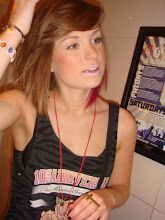
Here are some pictures I found on deviantart.com in the photography/people&portraits/expressive section. I looked at portraits because we want our photo to be of the main character on her own, and I looked in the expressive section because we didn't just want a plain portrait of the character we want it to be showing something about the film. These photos have given me lots of ideas and inspiration of how we can do our poster photo and it's also given me some ideas for shots we could use in the trailer as well.
I like this photo because of how they've layered a few different positioned photographs. I think using the same technique of this but using a close up of our characters face would work well for the kind of effect were going for on our poster, a distorted view.
This photo doesn't really relate to our theme exactly but i think it looks really effective and real, but obviously wouldn't be right for the style of image we're going for.
I like this image because of how close up it is which is what we are doing for the photo on our poster, I also think just showing the eye shows more expression but keeps the identity of the person hidden. If we used the same setup for our poster photo as this I would probably want to have the eye look bigger and probably make it black and white and with the eye a little further down so the eyelashes aren't cut out of the photo.
This is my favourite of the photos I looked at, it gives off an obvious vibe of horror which we want and it also draws you in and makes you interested and look closely. I think the fact it's black and white with the blood drip in colour is really effective and makes it fit in with the horror genre. I think this image would be easy to achieve just using a good camera and the editing tools on photoshop. I think maybe combining this photo idea with the first one using layers of photos could also work really well.
I also really like this photo because it's quite scary, a close up version of this maybe of just one half of the face would work really well for our poster. The girls expression makes her look terrified but it also makes the person looking at it scared as well because the eyes are like popping out which scares me but I really like the black going down her cheeks.
This image was created by scanning the face directly onto the computer. I think it gives a really good effect of being trapped but I don't think we would want to use this technique or layout as there are a couple of other effects that look and would work better.
'A Collective'
*Relationship
*Togetherness
*We-ness
*Connection
*Shared status
*Community
*Positive feelings for each other
"A collective is a group of entities that share or are motivated by at least one common issue, or interest, or work together on a specific project to achieve a common object."
'Identity'
*What makes you who you are?
*Your own comprehension of yourself- how you see yourself.
*How others see us
*Appearance
*Attributes
*Clothing
*Experiences
*Rituals
Area's of 'collective Identity.'
*Gender
*Ethnicity
*Sexuality
*Occupation
*Disability
*Social class
*Religion
*Nationality
*Celebrity
*Age
Theory's
On the one hand, identity is something unique to each of us that we assume is more or less consistent (and hence the same) overtime.. our identity is something we uniquely possess: it is what distinguishes us from other people. Yet on the other hand, identity also implies a relationship with a broader collective or social group of some kind. When we talk about national identity, cultural identity, or gender identity, for example, we imply that our identity is partly a matter of what we share with other people. Here, identity is about identification with others whom we assume are similar to us (if not exactly the same), at least in some significant ways.
David Buckingham (2008).
He argues that identity is complicated/complex.
"Identity is complicated. Everyone thinks they've got one. Magazines and talk show hosts urge us to explore our 'identity.' Religious and national identities are at the heart of major international conflicts. Artists play with the idea of 'identity' in modern society. Blockbuster movie superheroes have emotional conflicts about their 'true' identity. And the average teenager can create three online 'identities' before breakfast."
David Gauntlett (2007).
Gauntlett is talking about identity in relation to the media, I think that he tries to explain how ordinary people aspire to be like the people in the media like celebrities. I agree with him somewhat, but I don't think everyone is influenced by someone in the media, or maybe secretly they are. Other things such as parents, family, friends and life experiences also influence your identity, not just the media. However I think even under privileged countries are still influenced by the media, for example they may look up to great athletes, that have come from their country.
David Buckingham 2008.
"A focus on identity requires us to pay close attention to the diverse ways in which media and technologies are used in everyday life and their consequences both for individuals and social groups."
In a summary in order to look at identity you have to look at the media impact. What consequences the media has on people- on the individual.
Different medias which I believe have an impact on identity:
*Magazines
*Newspaper
*Films
*Soap Operas
*Adverts
*Radio
*Music
*Celebrities
*Internet-MySpace, Facebook, YouTube, Twitter
*Video games
*Self-help programmes
This is a song that I like at the minute, I think we could use music like this but if it was toned down if you know what I mean. For the beginning of the film we want to have dance music something your able to dance to, to get ready for night out. This is a dance track something similar to what we want to have, I think maybe the beginning of the song or the chorus. We looked at the music in the Prom night trailer which was non diagetic when it shows them getting ready and then the music stops as soon as the scary part of the trailer starts, whereas the tormented trailer uses diagetic music in the party scenes. This is something to think about when we decide on our music.
-Finish storyboard - done about a third of it and has been put on blog
-Research/decide type of music we want - roughly researched but not in detail
-Analyse filming that has been done - not done
-Choose picture for poster background - no research done but had discussions about it
This weeks to do list:
-Do some more of the storyboard
-Research more into music
-Think about dialogue, maybe start script
-Make more detailed shot list so we can start filming next week
-Decide if the filming that's already been done can be used, put a few clips of good parts on blog, decide how we can improve them for next week
In today's lesson we did about audience. You need to know as much detail as possible about the audience to be able to attract them, here is the basic information of our target audience which we need to know: Age of audience - 13-25 years Gender - male and female Where they're from - UK, Cities Socio-economic group - mostly category E, some D's and C2's and possibly some C1's Existing or new audience - existing Particular group - students Interests/lifestyle/values/attitudes - busy, social lifestyle, being with friends/in groups, shopping, cinema, meals, going out(town), parties, driving, Facebook, TV(American shows/reality, comedy shows), fashion, sport, music, drinking, smoking.
We also learnt about the six social categories. I mentioned above that our audience fits into category E, here are the criteria for the six categories: Category A - professional, higher managerial people ie. MP/surgeon Category B - middle management, administrative ie. bank manager Category C1 - junior manager, supervisory ie. personal assistant Category C2 - skilled manual people ie. plumber/machine worker Category D - semi-skilled/unskilled ie. cleaner Category E - casual workers, pensioners, unemployed ie. seasonal worker
These categories help to narrow down who it is exactly that will view your text. This links into the niche market, a specialist/specific market. The niche market is mostly used in advertisement because adverts are aimed at a specific type or group of people. Sky's specific channels like history, sport and drama would use niche market adverts that link to these channels ie. sports channel would advertise energy drinks, sports games, sports clothes etc.
Here are the first 11 still shots from our trailer. We might change these when we start filming if it doesn't look right or if we have difficulties with the location.


